Lighting a Night Time scene - Video Series

General / 31 March 2021

These video series turned out to be a bit longer than I initially intended, but it does cover a lot of ground on my lighting process. It's a 4 part (3.5 hours total) series on lighting a night time scene in Valve's proprietary Source 2 engine, from scratch.

Lighting is one of the most important aspects of game art, it makes or breaks the presentation of a level, it has an impact on performance and gameplay, since a good lighting pass may be used to enhance player navigation among other important things like telling a narrative through art.

Starting with a pre made scene as a daytime lit environment set in the city of Porto, we'll be covering different kinds of light setups, different kinds of lights and fog settings, materials, effects, prefabs, 3D Skybox, HDR Skybox texture and material, bakes, post processing and the philosophy behind lighting game environments.

If you want to experiment with Source 2 engine, you'll need to grab yourself a copy of Half Life Alyx, and download the workshop tools, that said however, I don't necessarily believe the techniques shown here are unique to this engine, quite the contrary they are interchangeable with any other engine you might work with, be it a inhouse or Unreal Engine as many tools tend to be very similar, I touch on a lot of "philosophy" behind lighting in game levels as I work on it, so come on and follow along... :)


Enjoy, and thank you for watching.

Report

Post apoc scene Breakdown

General / 02 January 2020

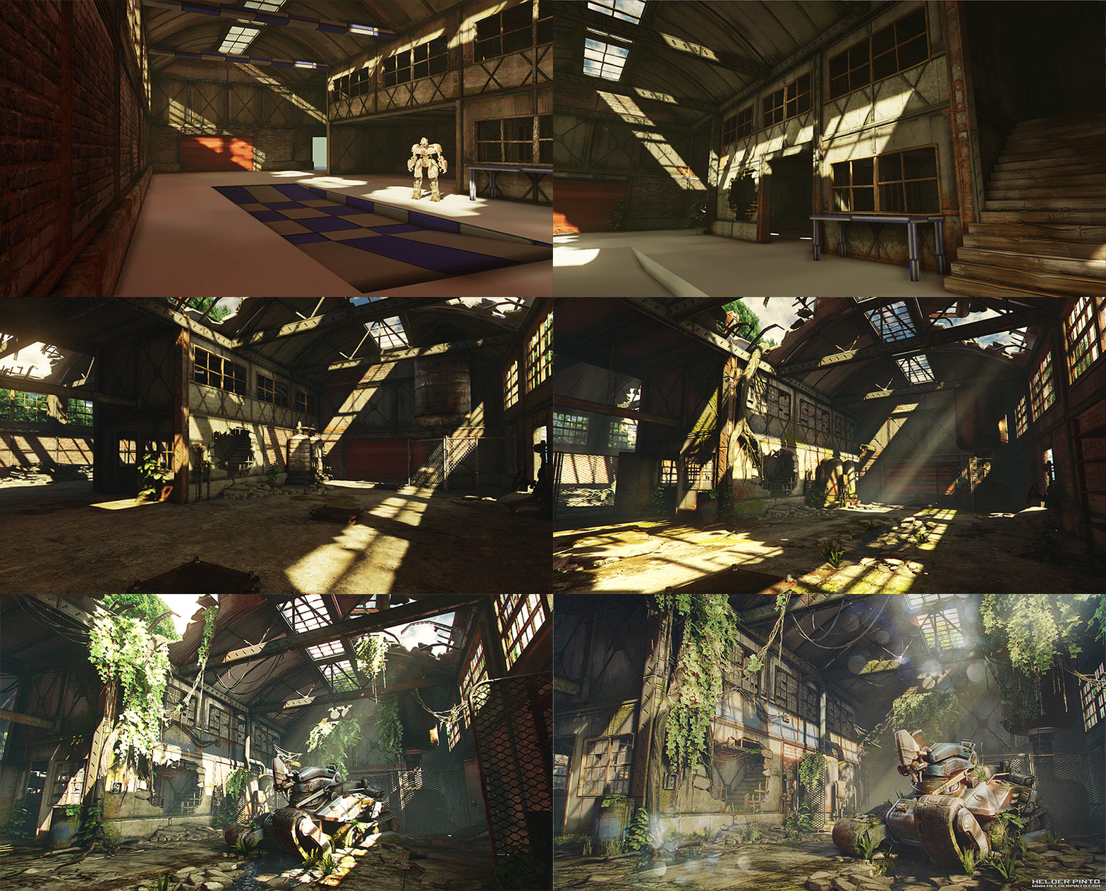
I’ve been getting many messages and e-mails requesting a breakdown of the scene I posted bellow.
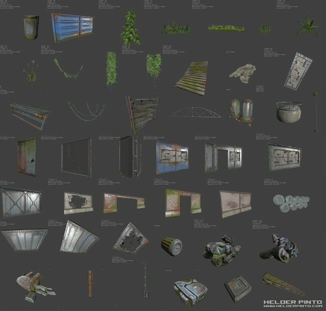
So I’ve put together a quick breakdown of the materials and assets used in the scene and the WIPs, hope you enjoy it and I hope I helped! And again big props to Tor for his amazing DVD. 


Modularity

Everything that qualifies as “architecture” is modular and snaps to the grid to make it easier and faster to work with. All the walls, ceilings, windows, pillars, beams, pipes all snap to each other in the same grid coordinates. Everything else like the vegetation, smaller props, cables, etc I just turned off the grid and placed them where I felt they looked good.


Materials and textures


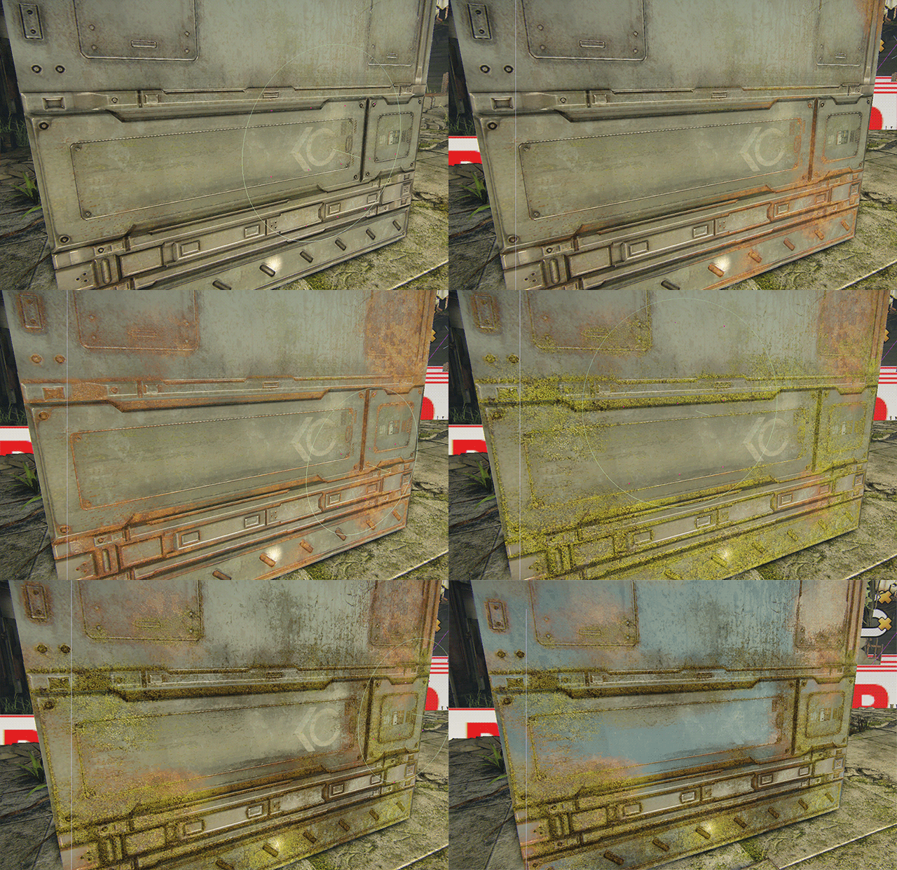
Apart from learning the engine, re-usage and smart modular environment art were my main goals with this scene,  so just like Tor explains in his UDK DVD, I’ve created a Master Material for the entire scene and have a few instances of this material for different purposes, this materials allow Vertex Blend painting withing the editor, so each instance of an asset could be painted individually from one another, to achieve a different and unique look, this process is great to achieve some very different visual results with virtually no extra impact on performance.
For instance, the Tank/Robot in the scene is using an instance of same Master material as everything else, I just swapped the textures. So, all the Rust, Moss, Paint and dirt was painted with the in-editor Vertex Paint tool, each one in the R,G,B,A channels respectively.
Only two master materials have been created, one for pretty much everything being used in the scene and another one for the vegetation.

As for textures, again, I wanted to make as much reusing as possible, the whole environment uses a 2048*512 trim sheet where I mapped the vast majority of the assets with, one tillable 512*512 for the floor, the Tank is using a 1024*1024 and two 512*512 for the vegetation. I also needed to create the very small tilable 256*256 detail textures for the moss, rust and concrete cracks.

All the normal maps were made using nDo2, as for the metal areas I decided not to model high poly and I used the techniques showed on this video, and I also used ddo for the metal grime and noise. These both apps are amazing, and I couldn’t recommend them more!


Post processing

Oh this was a fun one, I needed to study how to achieve good post-processing in UDK so I opened Epic Games Jordan Walker’s BatheHouse scene and studied how he managed to get that amazing high end look. And ended up adding vignette, a gradient to make the scene brighter in the bottom and darker on the top of the image, and a slight chromatic abberation. Also switched to a filmic tonemapper and tweaked it heavily to get the pastel and washed out shadowed areas.
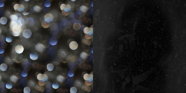
I also made dirty lens and bokeh effect, I used the bottom texture to achieve the effect and I’ve placed the camera dust / scratches in the Alpha.


Also, I’ve been getting some questions on how to do good post-processing.
Well, photography is one of my hobbies, and I got very used to image manipulation in a program called Lightroom from adobe.
So what I did was, I took a screenshot of the scene, worked it a little bit on lightroom until it looked just like I wanted it, then I went back into the editor and tried to mimic what I did in lightroom with the in-editor post processing tools, and I found this process surprisingly easier than I thought and it really worked, because you know exactly what kind of result you’re going for because you’re tweaking the parameters with a goal in mind, instead of just tweaking ’till it looks good.

That’s about it, on to the next project!

Thanks for reading!

Report

UDK – Arbor Vitae [breakdown and download]

General / 28 November 2013


This scene was a 8 week collab with the extraordinary talented artist and friend PhilipK.

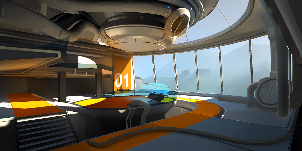
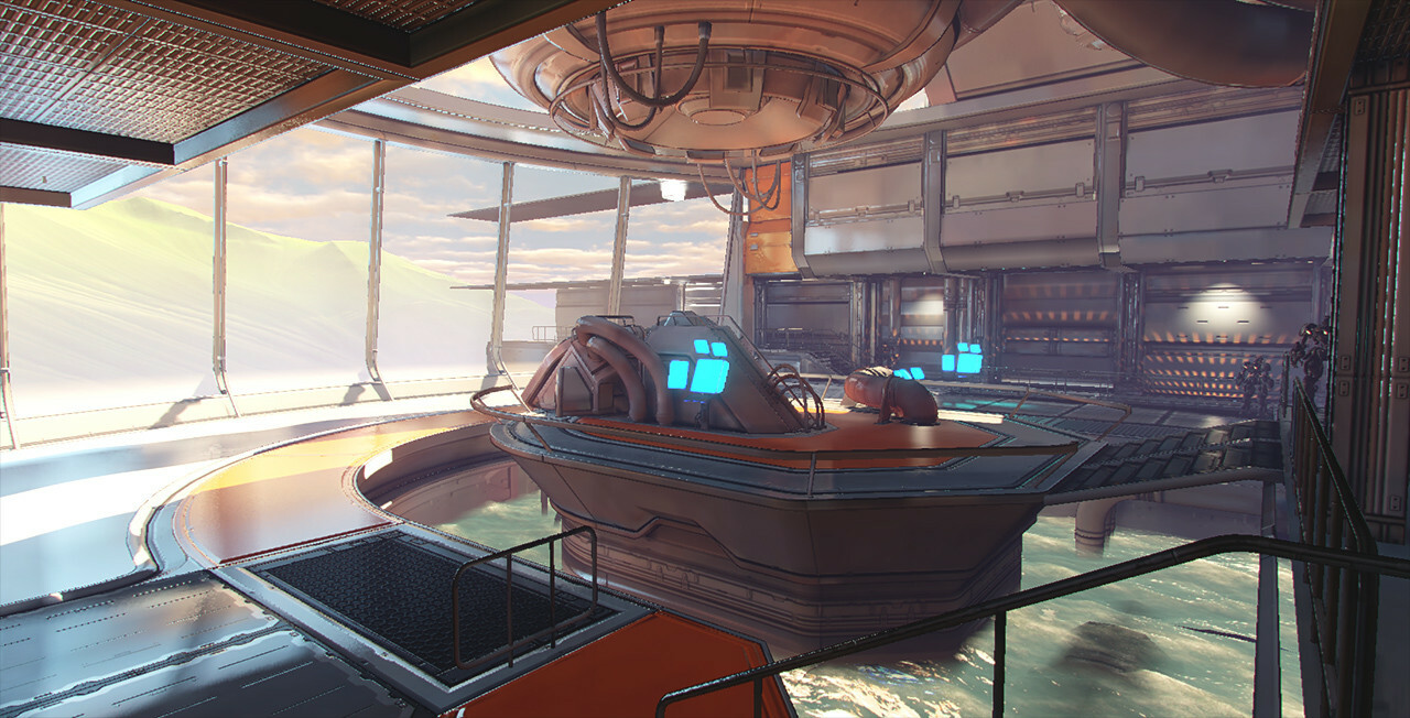
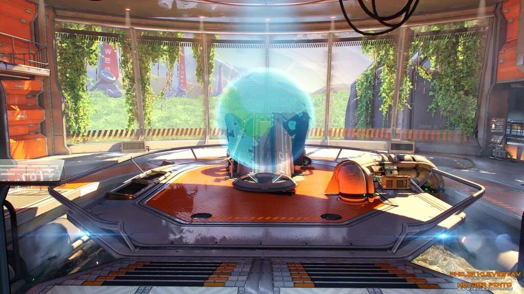
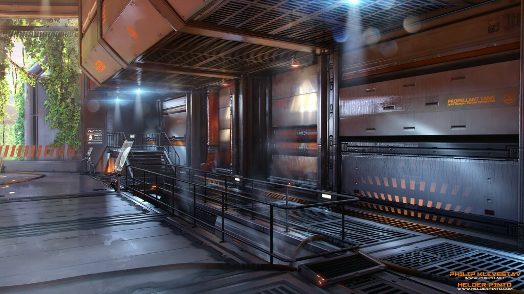
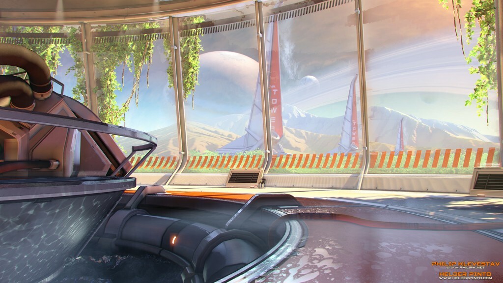
The idea is here is that Humans have colonized this planetoid called Askalaphos, and are in the process of creating an atmosphere similar to planet earth by using an atmosphere processing station. The air outside is not 100% breathable yet, but it already allows for the growth of vegetation, specially in the vicinity of the station, and the stations around it, hence the use of H2O as the main element of the scene, the whole point of this facility is to create a breathable and living atmosphere which couldn’t not be possible without… Water! No water, no life anywhere!

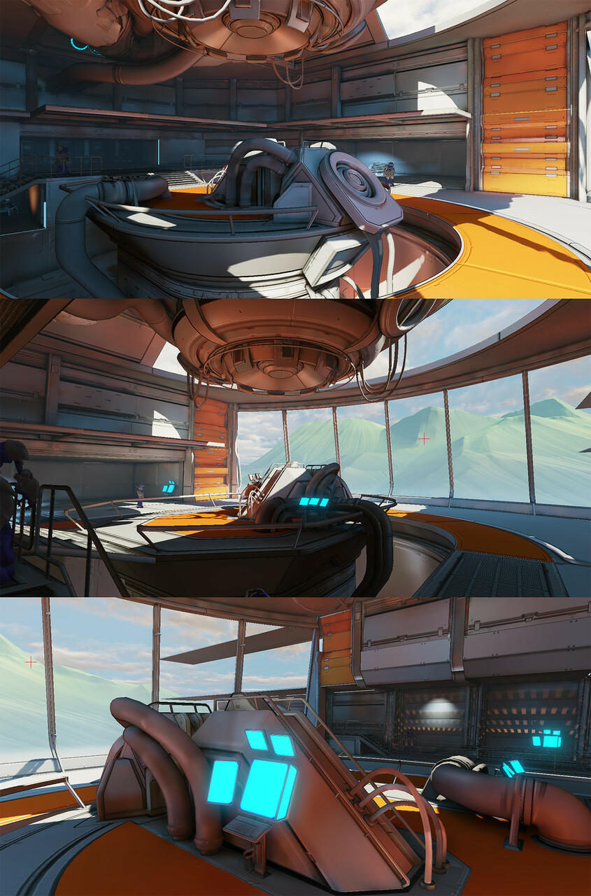
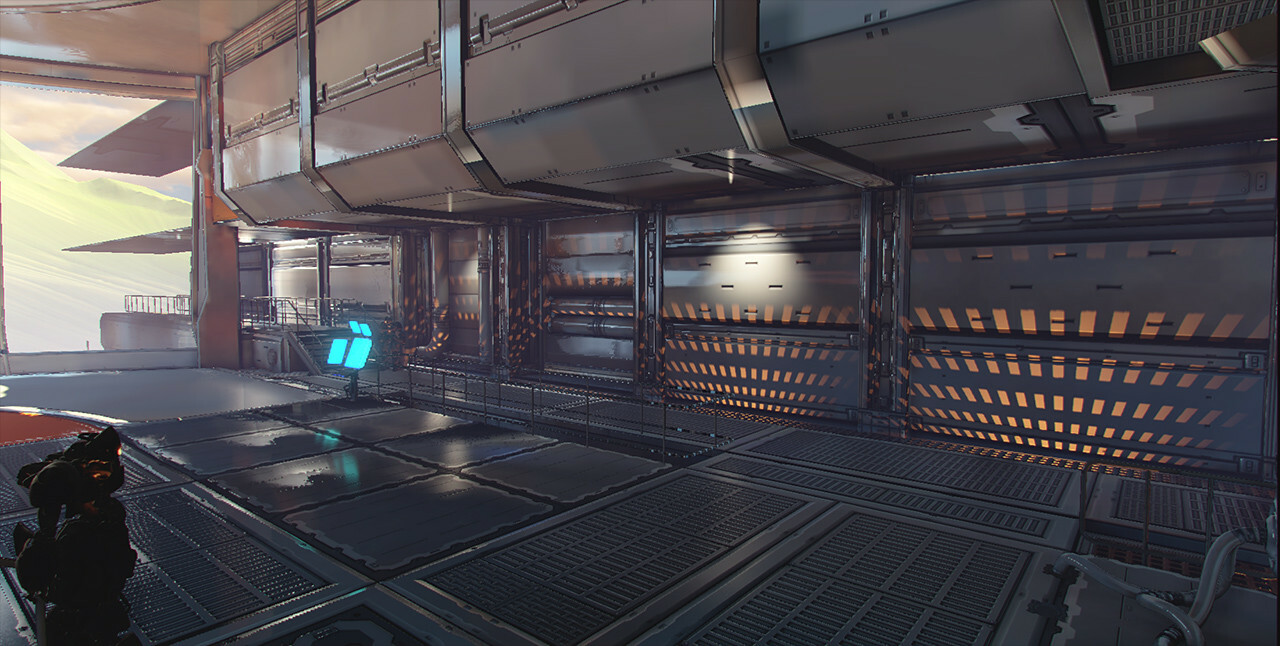
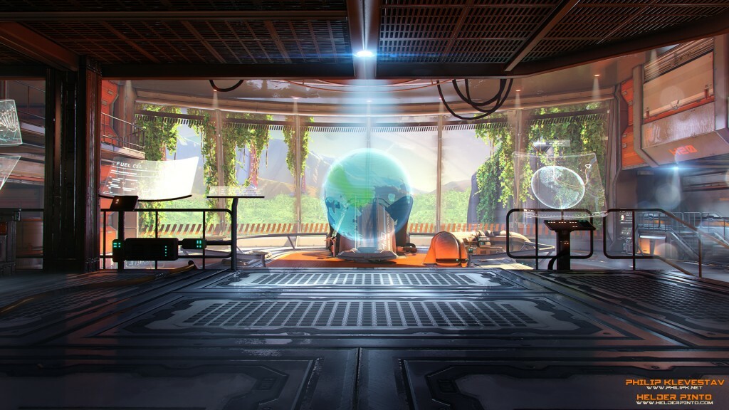
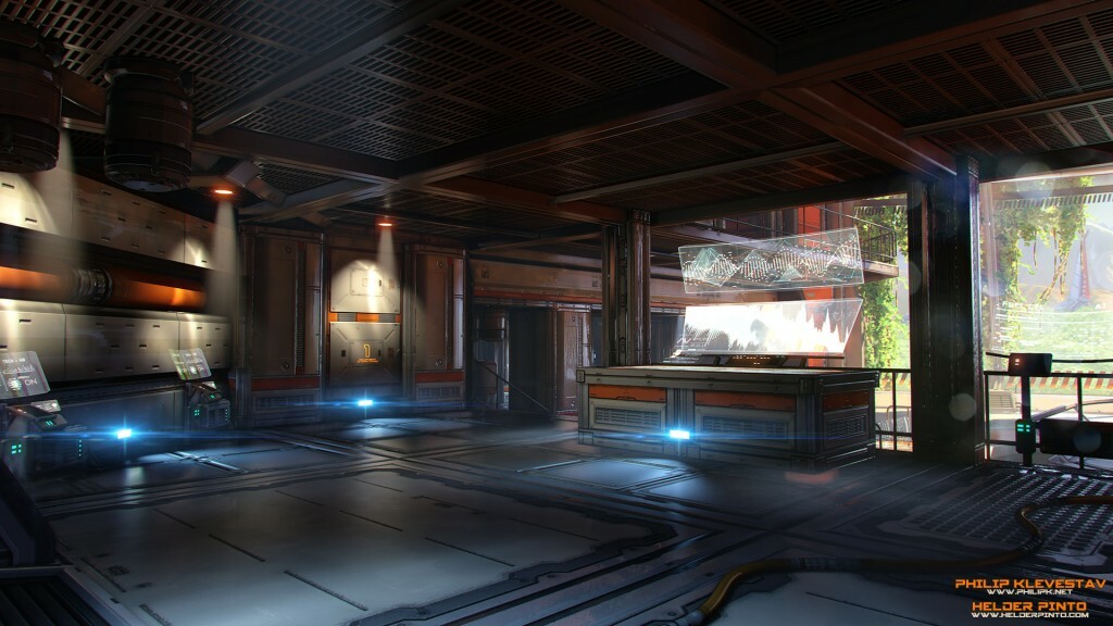
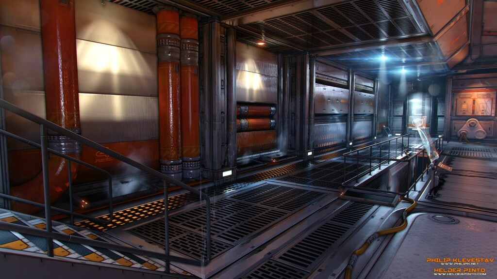
The scene is set inside one of the outer rooms of the station, more specifically inside one of the big control rooms, featuring a gigantic window with a beautiful view to the outside world, which from that angle you’ll be able to see the other end of the complex, the other towers, natural terrain and the sky. We wanted to make use of bold colors and staying away from the same old desaturated look you typically see in sci-fi, we were also set on staying away from gritty/scary as much as possible and instead try and make the space seem like it’s livable and looking almost inviting. This whole facility is built around the idea of creating life!

DOWNLOAD

We’re releasing this UDK package and map so people can learn from it, don’t use it for any commercial purposes.
IMPORTANT: We recommend using DirectX11 render mode to properly view this scene. Go to “File – Switch Renderer – DirextX11”

Have fun and check our WIP threads if you want to know more about the making of the scene:
Mapcore WIP thread: http://www.mapcore.org/topic/16660-arbor-vitae-udk-scene-wip/
Polycount WIP thread: http://www.polycount.com/forum/showthread.php?t=127659&highlight=arbor+vitae


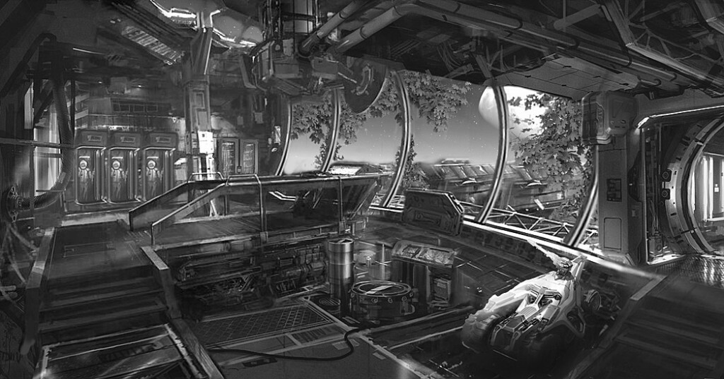
Here’s the concept I made to start this scene with, it’s what we used to get us jump started on the visual language we would be going for, taking very strong inspiration from Doom 3 and Halo 4.


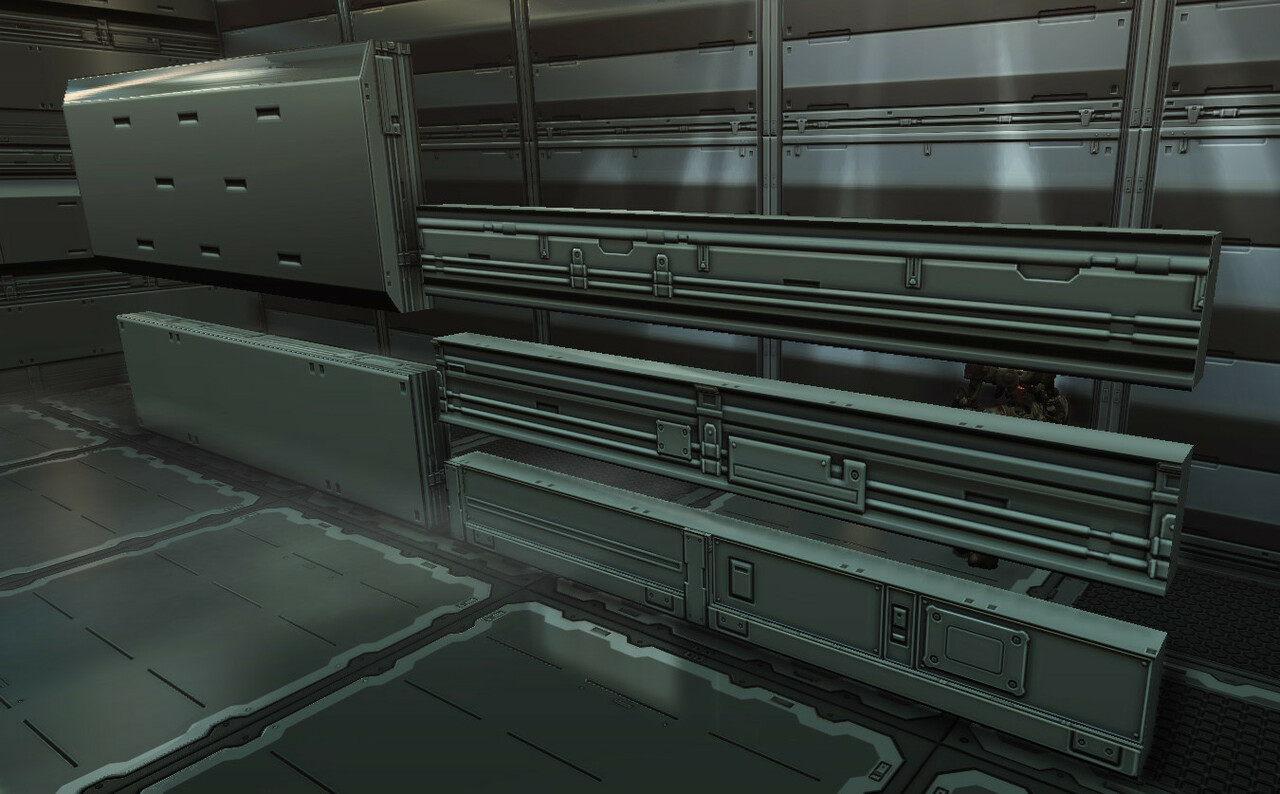
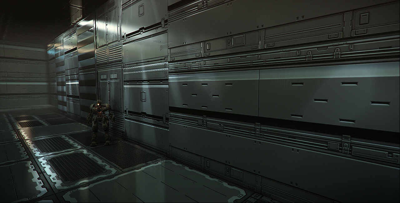
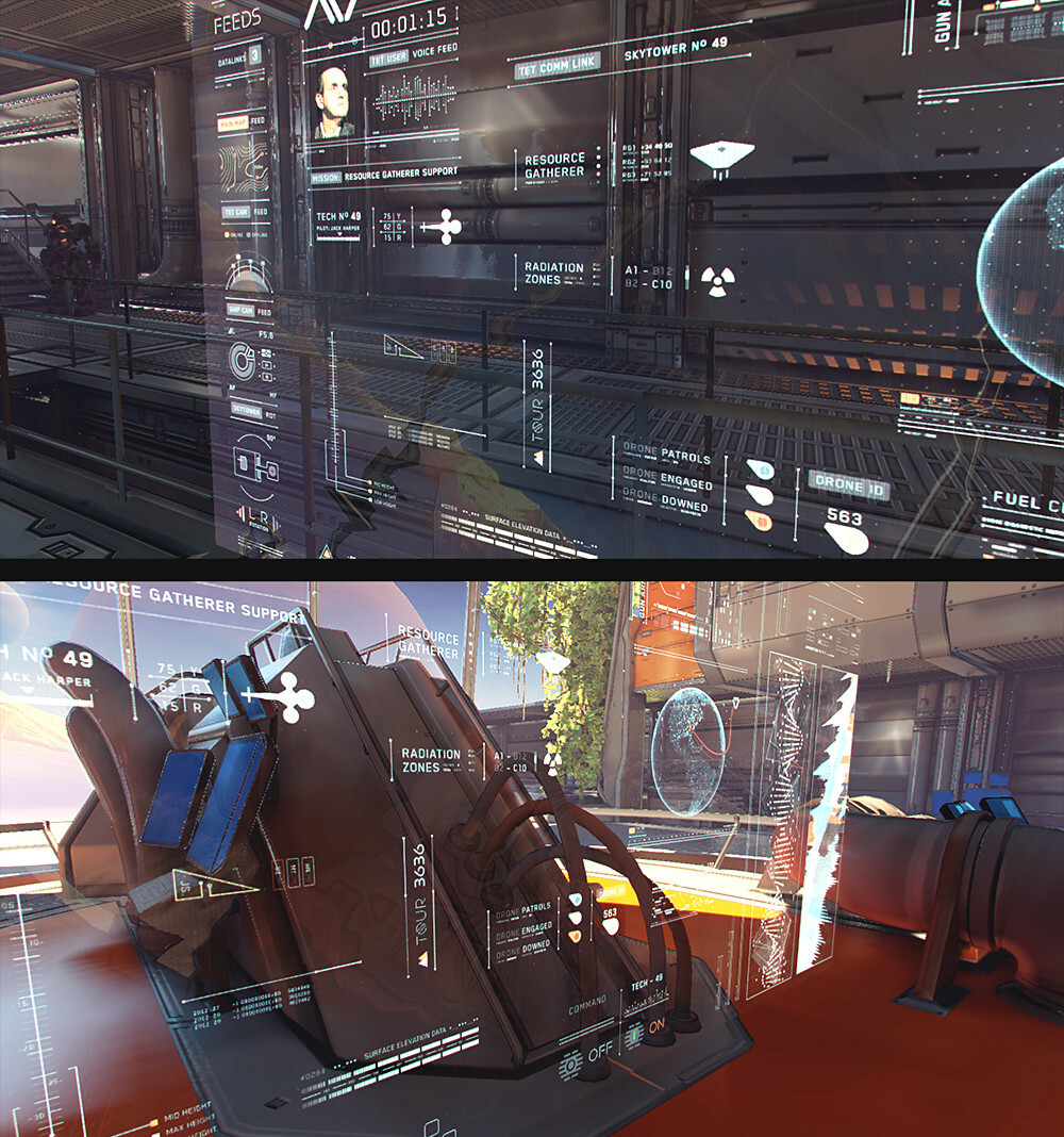
Some WIP pictures taken from our forum threads:


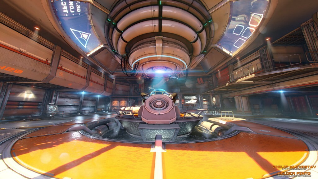
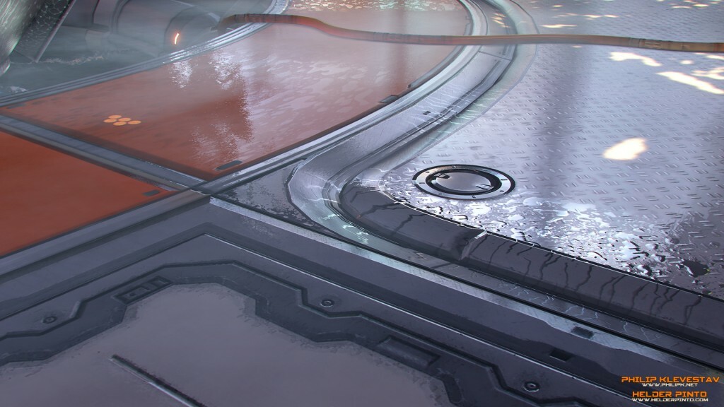
And here is finalized scene:


Report