(Missed part 1? Check it out here)
Ultimately decided that with some careful material blend, texture tweaks and set dressing, I could get this freaking round wall and the small alley next to it to look natural.
Also, started to do some set dressing here and there.
Here's how the wall and the small sloped alley looks from the other side. I ended up making a brand new texture uniquely for ground here, it tiles only in one axis so I could get the sides to gradient just like the way I wanted it.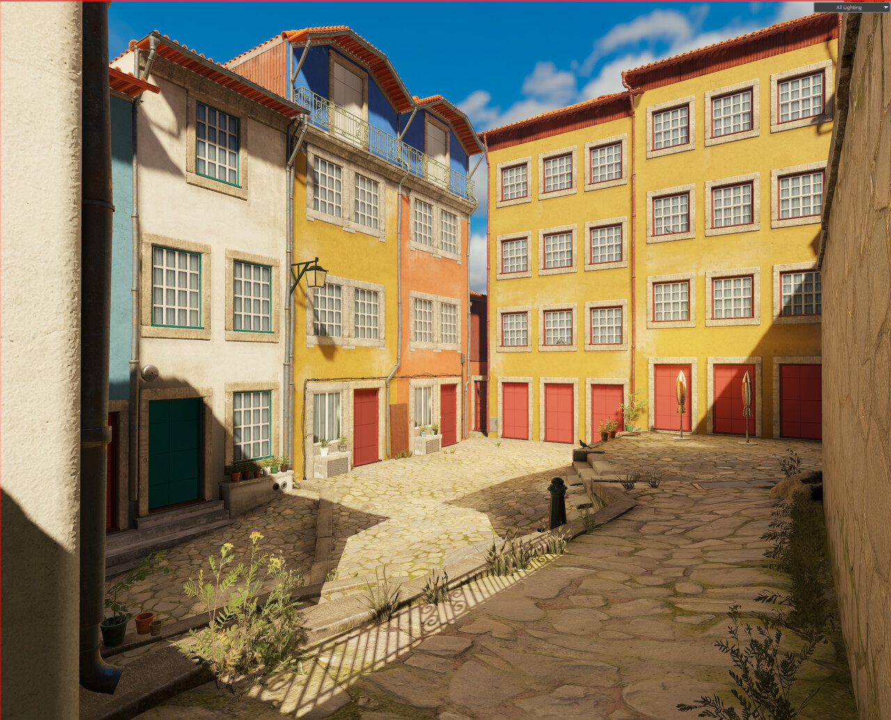
Started to give some of the smaller back alleys some love and modeled a unique building to the far end of the alley, as I found that copying and pasting the same buildings over and over was becoming a little repetitive, so I took the time to make a unique building there and make it very different by not using plaster on it, and instead it being fully made out of stone.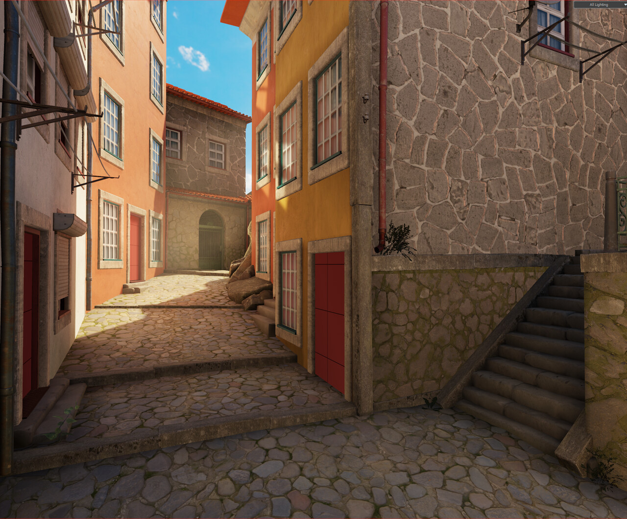
At this stage, some of the sidewalks and roads were feeling a little flat. Fortunately, hammer comes with a built in sculpting took, just one hotkey away, so I tessellated the terrain and gave it a few brush strokes around the whole map.
Here's the final result of the ground, just wobbly enough to get that organic and old cobblestone look to it.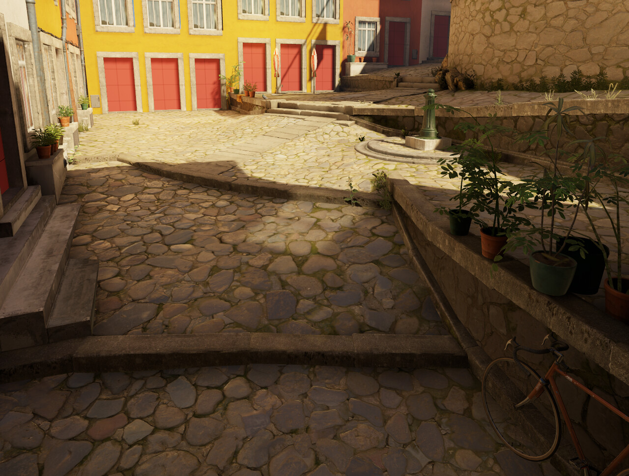
Good time as any to take a step back and reevaluate the main shot of the scene and tweaking a few composition elements, moving a few props and tweaking the lighting. Notice how I try to jump from one thing to the other constantly, your whole map is your canvas, so avoiding spending too much time on a corner of the map or some detail that no one will ever see is usually not wise.
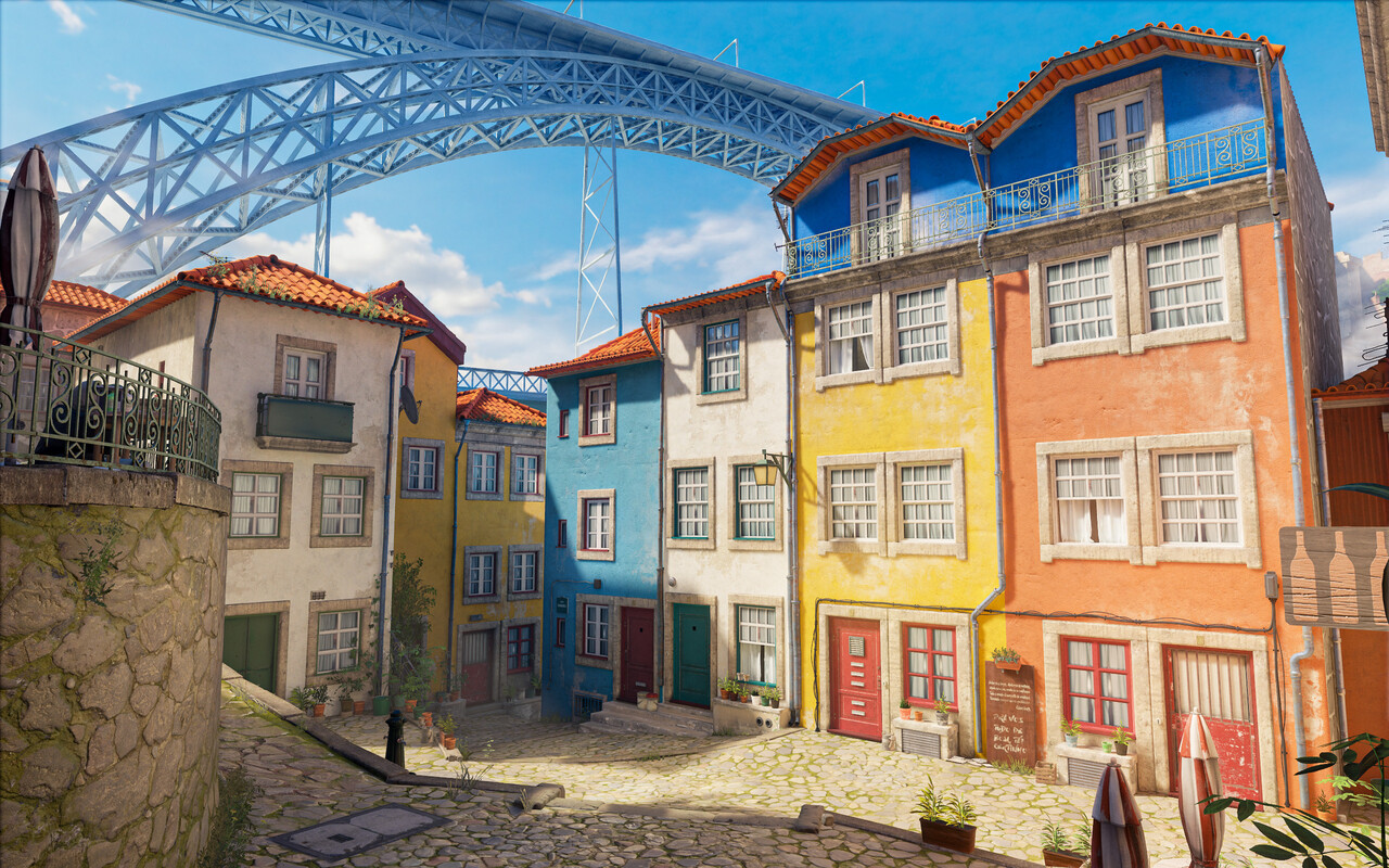
And with that, I realized that the blue sky was looking a little empty. I really wanted to have a saturated beautiful blue sky but it was lacking something. This scene being set in Porto, this is the perfect opportunity to feature the famous "Luís I Bridge", so I quickly blocked that out and made a 3D Skybox level, that Hammer requires to make backdrops with.
So as the main area of the scene is nearing what I'd consider finished quality, I still have the back rear alley and corners of the map to give some attention and love to, and I still have the doors and windows to finalize. I left that until the end, as I knew it was technically a small detail.
Total, there's about 3 different buildings that I copied around, and just applied a different plaster material to them. This, while wise to do to cut on time it also lends itself to repetition, so I made sure that all of the corners of the map have a uniquely modeled building, hiding the repetition and giving me a good opportunity to add some unique detail to the map and have some fun with set dressing.
Also tried to use big rocks to hide some intersections, I tried this before and didn't exactly work but if done with care it could work. I could also place some weeds around the rocks later so it blends even better.
And here's the opposite corner, also featuring a unique building, and a modular kit of stairs, to break up the corner a little bit too. Since these buildings are unique, I made sure the vertex blend really pops a little bit more than the others, and the shapes are a little bit more angular and irregular, use all the changes you got to break up repetition and make things look unique.
I also finally ended up making a new parallax material and texture for all of the windows.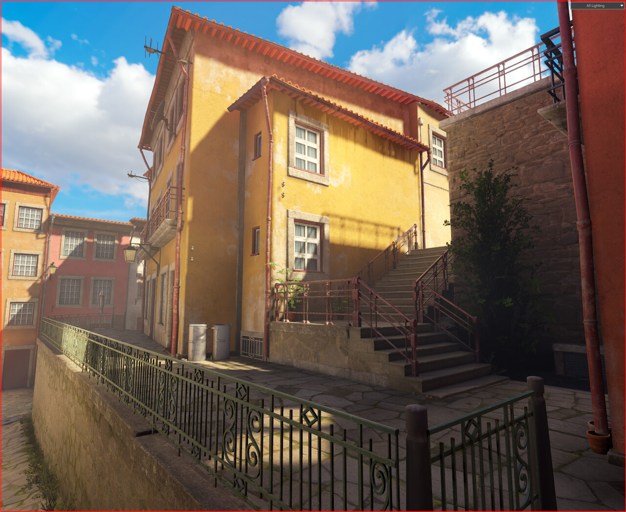
Then I made sure everything looked good around the map, checked for floating geometry, texture seams, lighting bugs, added a few ambient sounds, etc.
Also made a unique 3D skybox with some far away buildings to complement the bridge, added a new HDR sky texture to the skybox too, finished the bridge, made my own post process and color correction, finalized and pushed the lighting a bit by manually placing some point lights to enhance the color bounce from the walls, also placed quite a few "fog pointlights" around to give the gameplay areas a thicker feeling, did a set dressing pass around the whole thing and a "story" pass too, by naming the restaurant, the streets, and created a few flags using the cloth sym system build it in the editor, the flags are from the local sports club (F.C. Porto) and obviously the Portuguese flag, try and find them. :)
Also made a newspaper prop with a real life texture from the front page of a local sports newspaper, hopefully the locals will appreciate the little detail.
Among other (not so) small details, like making a street plaque and naming all the streets with usual Portuguese names, all icing on the pudding that makes all the difference in the end.
And bellow, a short flythrough video and the final screenshot.
Click here to open my portfolio and see the final scene in HD.
Thank you for reading, reach out if you have any questions I would like to know if content like this is of any help at all.
-HP

